Friday, January 30, 2009

Creating Ancient (looking) manuscripts in Photoshop (a tutorial)

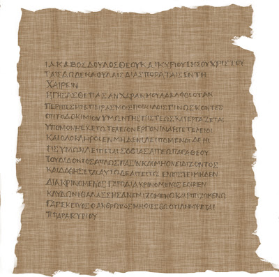
As I work on the graphic translation of the epistle of James, I am trying to get a sense of how scripture is transmitted from age to age, starting with the letters being written on papyrus. I went to an exhibit at the Smithsonian a couple of years ago which displayed hundreds of manuscripts, and I loved the look of the writing on the papyrus. In trying to recreate what the Epistle of James might have looked like, I created a digital papyrus in photoshop.Here is the process I used:
1. starting with a new document, fill the page with a light to medium gray.
2. Apply the Texture- Fiber filter
3. Adjust the contrast to a light medium tone.
4. Copy image
5. Create a new layer and paste image into the layer
6. rotate the image 90 degrees
7. change the layer opacity (to about 40%), which allows the texture underneath to show, and creating a wonderful cross hatch. When you get it the way you like it. Merge layers.
8. The light and dark stipes were created in a separate layer by drawing white lines with a brush which had soft edge to it. I adusted the opacity until it looked subtle, then merged it down to the lower layer.
9. Change the color to a sepia by adding a layer mask above it.
10. Select the color you want.
11. In layers, Click on Hue/Saturation mode, and tick colorize, which colorizes the layer beneath it in the hue.
12. The edges of the papyrus were created with a rough brush in photo shop, painting white around the edges.

The lettering was created separately, written by hand on rice paper and then scanned. Many of the ancient manuscripts in greek were written all in capitals, with no punctuation, or even spaces between the letters (which is one of the reasons I have the greatest respect for the scholars who dare to sort through the text to make it legible for the rest of us!!!!) The image of the lettering was imported into the papyrus file and copied into a new layer, which was set to 'Multiply' and an opacity of 60% to allow the sepia and texture of paper to show through. You can see the final results above.

Tuesday, January 27, 2009

Parable 12 Unclean Things


A Graphic Translation of Matthew 15: 10b-11, 17-19

Saturday, January 17, 2009

Rockwell Exhibit at the Chrysler Art Museum in Norfolk


I went to the Chrysler Art Museum in Norfolk today to see the traveling exhibit of Norman Rockwell art on loan from the Rockwell Museum. The show is amazing, and well worth seeing. (It is in Norfolk until Feb. 1st.)Rockwell is one of my favorite artists, and has been a great influence on my work in illustrations. Many of my early posters were drawn 'in the spirit' of his work. His love of people shines in all of his paintings, especially in the attention he gives to the distinct character of each face.


Seeing his art in person is even more amazing. The cover reproductions from the magazines did not do his work justice. He worked on such a large scale that it is not surprising that he could include so much detail, and the colors are more vibrant and true to life than the reproductions.


One picture stood out to me this weekend. "The Problem We Live With." A cover he painted for Look magazine in 1964. The image is one of his most famous and controversial in its day, that of a schoolgirl being escorted to the newly integrated public school by four US Marshals. Previously, when I had seen the picture in books, I saw it simply as an image of innocence walking through danger. But looking at it upclose today, I was impressed by the courage I see in the painting. The girl in the picture is fully aware of the danger she is in, but she does not shrink from it. She keeps her head up, looking straight ahead, not looking at the crowds, or at the person who just through a tomato at her (looking at the painting, you can see just how fresh the tomato was!) You can see the muscles in her arms and hands, ready for action, the purposefulness in her step. There was another aspect that I did not see before. Because of the large scale of the picture, and its placement on the wall, I was aware, for the first time, that Rockwell puts us, the viewers, on the sidelines, perhaps just a few feet away. He makes us part of the crowd. It reminds me of the reading of the Passion story on Good Friday, when the parts of the story are acted out. The most chilling and real part of the experience for me is when we all say the part of the crowd, "Crucify Him! Crucify Him!" It is an uncomfortable and unsettling feeling, to know that any one of us could have been in the crowd, and in the heat of the moment, condemned an innocent person to die. This painting has the same effect. Where would you, or I, be in the crowd?Would we have thrown the tomato, or written the hateful graffiti on the wall? Would we have been silent, and let other voices cry out? Would we speak up? I think there is one final clue in Rockwells painting, that puts us in our place. The vantage point is from the eye level of the first grade schoolgirl, which means the viewer is probably the same age. A child. Perhaps the painting puts us in the place of one who may be influenced by the voice of the crowds, or be moved by the courgeous child, and follow a new path to the future.

Friday, January 16, 2009

Drawing of the Temple Mount


This is a drawing of the Temple Mount in Jerusalem, circa first century (Herod's Temple). The view is looking over the Antonia, the fortress/prison which overlooked the Temple. There is a great article on the Antonia in this month's Biblical Archeology Review.
The drawing is background to the opening of the graphic novel translation of the letter of James. Taking a lead from the address in James- "to the 12 tribes in dispersion" (the diaspora) I will be setting the 5 chapters of the letter against the backdrop of the church dispersed through history. It will move progressively from the first century to the twenty first. I have the Greek translation roughed out, and there is fantastic material to work with in the story. 'James' , like the other writings in the wisdom tradition uses vivid imagery to convey thoughts and ideas.

Monday, January 12, 2009

Earnest Illustrations on the web

My new website has been uploaded (published) to the internet, and is making its way into the various browsers. The website inlcudes the pdf files of the parables series which have been in this blog, as well as other artwork that I have done in the past. I hope to make the website user friendly and a resource for ministry. Please check it out when you can, and let me know what you think. (And feel free to share it with friends and colleagues.) The Address is http://www.earnestillustrations.com/